
Collaborative Design Processes
- Peter Morey
- May 8
- 7 min read

Updated: May 12
Using the 'Rich Picture' and 'Design Thinking' methodologies to co-create for communities
Mostly I do Live Illustration aka Visual Scribing. Visual Scribing has its home in very swanky consulting methodologies, believe it or not. Famous proponents and architects of certain high-profile visual consulting methodologies include Matt and Gail Taylor (of the MGTaylor and ValueWeb methodologies), and David Sibbett (The Grove Consultancy). They are/were respectively an architect, a Montessori school teacher, and a business strategy guru, working from the 1970s onwards.
The collaborative design workshops ('Design Shops' as copyrighted by The Grove) influenced by these methodologies are multi-modal and draw on 'The Arts' broadly: From environment design (where are the chairs going?) to visual thinking and modelling to music, ambience and music composition, as well as process awareness and mapping. It's where the 'divergent' and 'convergent' ('double-diamond') stages of group discussion/thinking emerged as a thing. It's where you might hear phrases like 'we're in the problem-space now; please hold back on solutionizing until we're in the solution-space.'
Artists were invited in to all stages of these workshops to document and model laterally and very visibly, on large scale bits of paper/walls/whiteboards; and participants ('delegates') were encouraged to use similar visual thinking based on these exemplars - often diagramming processes or structures or strategies within their business.
At some point, the artists' role became very commodified as illustrators began entering the field, with highly developed visual muscles and an acute awareness of style and its commercial value as a product in itself. I myself am one of these, having started practicing after an MA in 'Authorial Illustration' (I interpreted this as 'comics') completed in 2013.
This became the modern field of 'Visual Scribing' aka 'Graphic Recording' and it became a specialised role separate from (but often orbiting) 'Graphic Facilitation.' Outputs from workshops began to look much much nicer, and delegates were (ironically) encouraged to draw for themselves less and less, and the function or role of graphic recorder/visual scribe changed to new situations as more and more people saw how great it could be.
The whole question of 'Design Thinking theatre' began to emerge, where workshops became areas of artistic performance for visual scribes, engaging participants with a real wow factor. The performative nature of social media has accelerated this sense of theatre, to the extent that I find myself actively gauging from client briefs, to what extreme of the 'visual scribing' spectrum - from performative to facilitative - they would actually like for any given engagement. Often this comes from the intended use for images produced - I can ask 'is this for your socials or is it part of a process you'd like to keep internal and functional to your business?' and I will know what my expected role is.
I am relatively neutral as to whether 'performative' or 'facilitative' has more value, but on a personal level I do often enjoy working with the client (towards more facilitative, collaborative) more than delivering for the client (towards more performative, service-oriented). As ever, the reality is always a mix across a spectrum - and often a client who engages initially on a surface level will be really really impressed by the deeper levels of the activity (and vice-versa).
In any case, this blog post has become a ramble about the history of visual facilitation and scribing. What I want to actually show, is a use case where I have taken valuable lessons from the various corporate design thinking environments I've been part of - think lots of post-its and flip-charts - to designing a valuable thing, collaboratively, for a client and their community stakeholders (like architects and designers do):
It is the project I'm most proud of to this day. It is from 2022 and it is for ACAVA and the Grenfell Foundation - the map for 'Walking As One: The Grenfell Memorial Community Mosaic.' I wouldn't have been able to do this without my experiences in corporate design and strategy workshops, and what they taught me about working collaboratively.
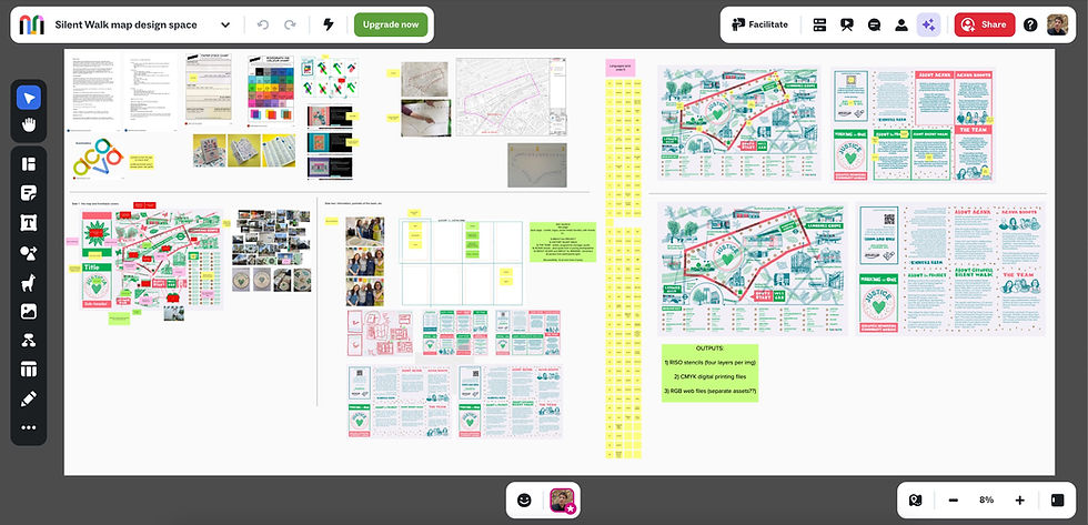
First Stage: Dumping all the 'inputs' from the client to a shared space - here I used MURAL because it is highly visual, interactive and shareable among groups/teams.
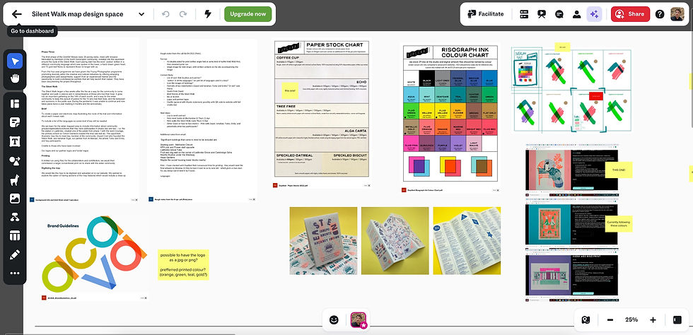
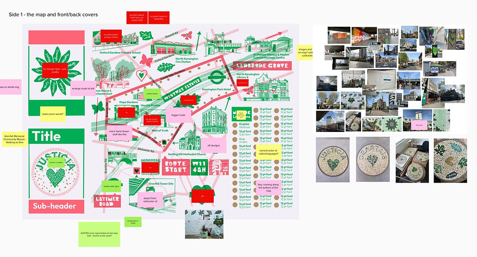
Here you can see that we are in the 'problem-space' for a map project and have started to decide together on certain parameters of the project - it will be a Risograph outcome with a particular printer, so we need to be disciplined about colour choice, and the map must be designed on highly defined layers. I was able to show this to the client and bring them in, rather than simply telling them how it should be. We decided on a colour scheme after a colour test done digitally on Procreate; using swatches from the printer; and showing a mood-board of examples of 'This-Type-Of-Thing'.
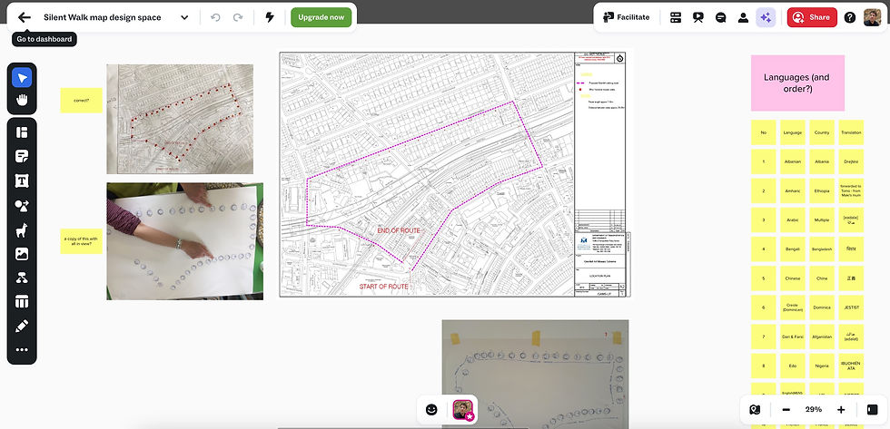
Transition to Middle Stage/s: Defining and gathering the primary content.
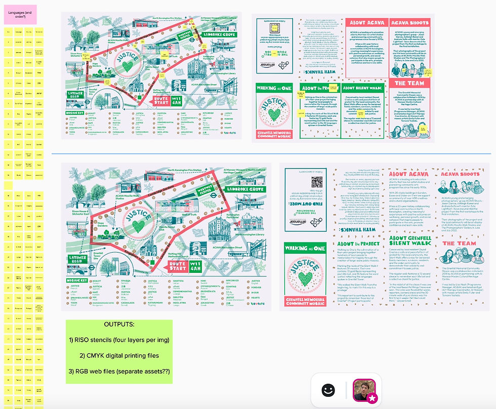
Here we have the main focus and purpose of the project: To map out 39 mosaics that have been made in community workshops in North Kensington, and are being installed along the route of the 'Silent Walk' route in memory of the loss of 72 lives at the Grenfell Tower on 14 June, 2017. So, after a discussion, we decide the main point of reference is the schematic for the installations, and the roundel design used in the workshops - 'Justice' set in 35 of the different languages spoken by the community who lived in the tower.
Then... "HOW MANY LANGUAGES?!" wow... errr... 'do you have those written down somewhere?' 'Can you send them to me?'
Then... 'thank goodness this platform can transfer a list made in Word into defined post-its with each word for 'justice' on its own discrete post-it.'
And... 'I had better download all the different keyboards for all these different scripts to my ipad, so I can typeset in Procreate.' [Cue lots of downloading and installing by me, the designer/illustrator]
Middle Stage/s: My active research and engagement begins
Here I show my stripes and start producing things for the client. To do this, I went on the Silent Walk route and took lots and lots of photos. I spoke to the client on site about the project they had been doing for the best part of 2 years already - and I took more pictures of some of the mosaic designs that were outputs from community art workshops. Importantly, I had some strong emotional responses to my walk, and I could see visible traces of community memorials already in place: from flowers laid down to graffiti to the more formalised 'Wall of Truth' under the Westway. I got a feel for the neighbourhood and how I might live there if I wasn't based somehere else (at the time - Harrow, NW London). I got a feel for WHY this project was initiated.
This stage was also the first stage where I could take something concrete to the client and stakeholders, and they, as a group, could 'throw rocks at it'.
It was very important for me to see my precious illustration as a first iteration and not a final piece at this stage. The rocks came in the form of post-its; and because of the platform we were using, they were recorded visually and could form the basis of a design discussion. this happened over zoom while I was having down-time on another job in Copenhagen, from the lobby of my hotel. And yes, more post-its were gathered.

Middle Stage/s: What's on the back of this map?
This was defined very much by how it was folded. If I could show the client that there are EIGHT SECTIONS available and they are A6 SIZED, we could work from that.
What emerged was a nice front and back cover, with an EDITORIAL VOICE emerging from the client and her team.
This pointed towards collaborators, the depth of the project so far - a strong desire to document and describe work done, and to credit and celebrate all those involved.
You can see that I described the basic form of the output in working diagrams. These proved very helpful as a form of practical visual thinking.
Other choices that emerged were things like font/s, framing devices, and whether to use tabs for quotations.
Then... Gathering quotations! - which led to some lovely quotes from key players such as passionate community organisers of the Silent Walk.
Transition to Final Stages: ITERATE ITERATE ITERATE (within reason and budget, please)
This is where I iterated the design according to all the post-its and design discussions. we had budgeted for one main iteration and in reality this included a few smaller iterative tweaks after that so we could get it PERFECT!
(Even though Perfect is the Enemy of Done, my friends)
FINAL FINAL STAGE: Preparing for the RISOGRAPH print process
The most important bit about this stage is that it can appear invisible to the client. So, it needs to be explained upfront and budgeted for.
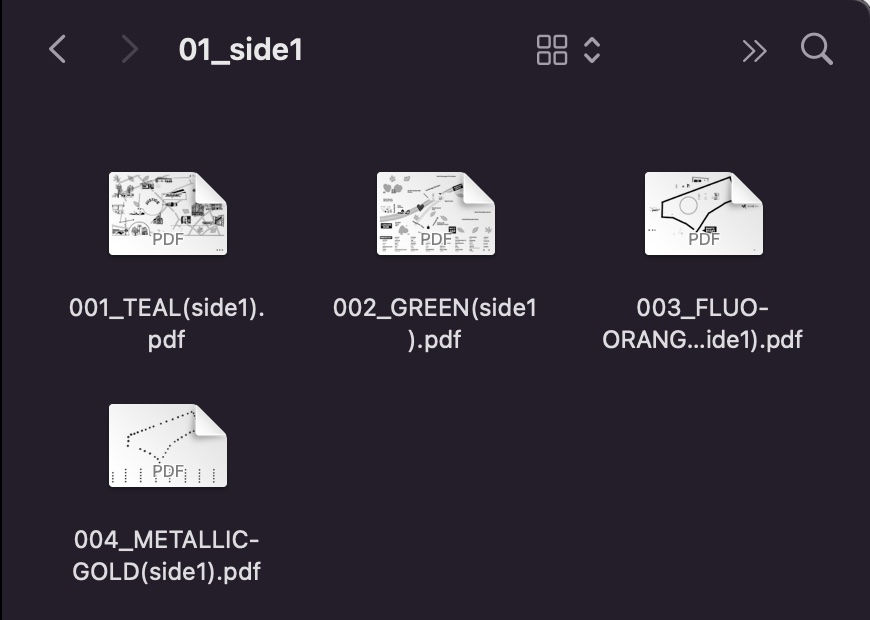
For this, it was either a day or a half day of my budgeted time to prepare colour separations and provide them in the right format for the printer.
This involves collaboration with the printer - in this case, the wonderful DUPLIKAT PRESS in Margate.
Also, this stage gets easier if I have been disciplined about maintaining separate layers throughout the project. Actually quite difficult to do when it is an iterative process.
This was a FOUR COLOUR separation in TEAL, GREEN, FLUO ORANGE and GOLD.
The Finished Product
Here you can see the final product as handled by me, years after its release.
It was handed out to everyone for free at a local launch of the entire Mosaic project, which included an exhibition of photographs by the ACAVA SHOOTS cohort of young photographers who documented the years-long community project.
It was also handed out onwards in the community.
I had a few copies which I handed out at a Zine Fair that I was part of organising.
I have just framed my last copy, which I managed to get signed by Emily Fuller, one of the mosaic artists who led workshops, and two of the community artists who made the mosaics in those workshops.
I'm very proud of it.
Justice. Forever in Our Hearts.

Comments